Branding & Identity
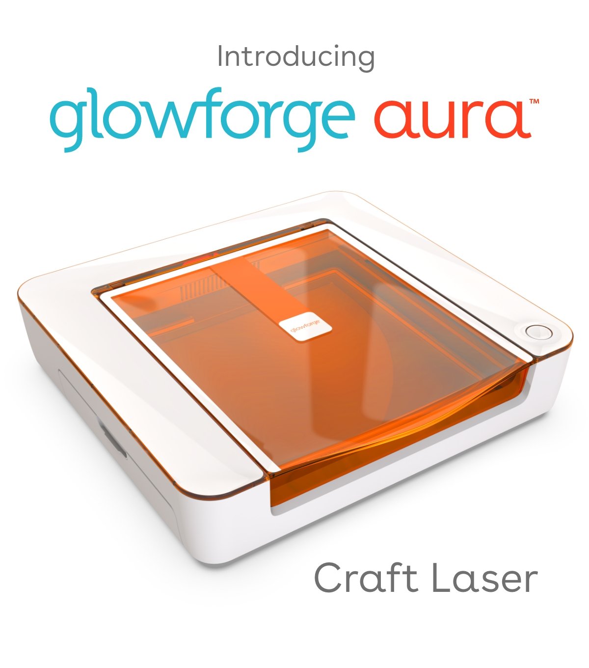
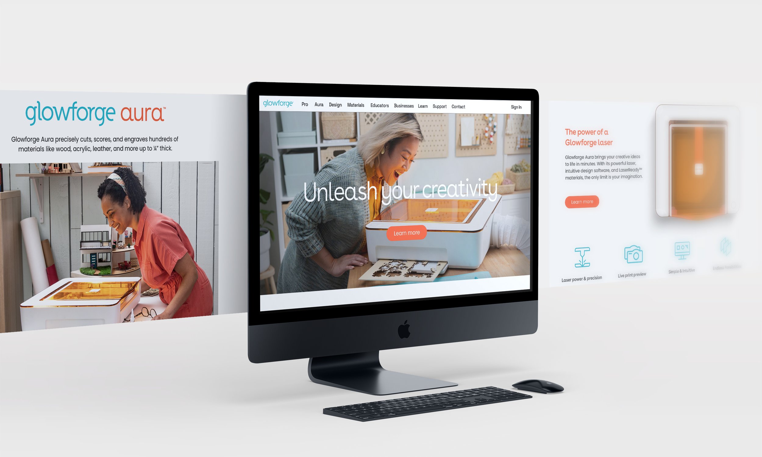
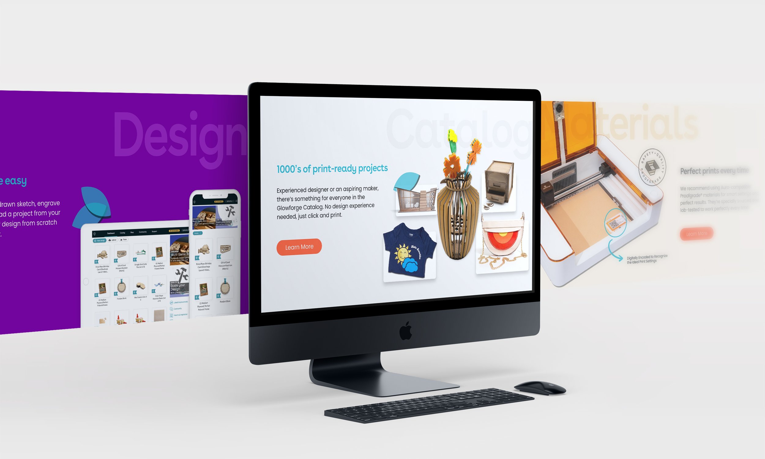
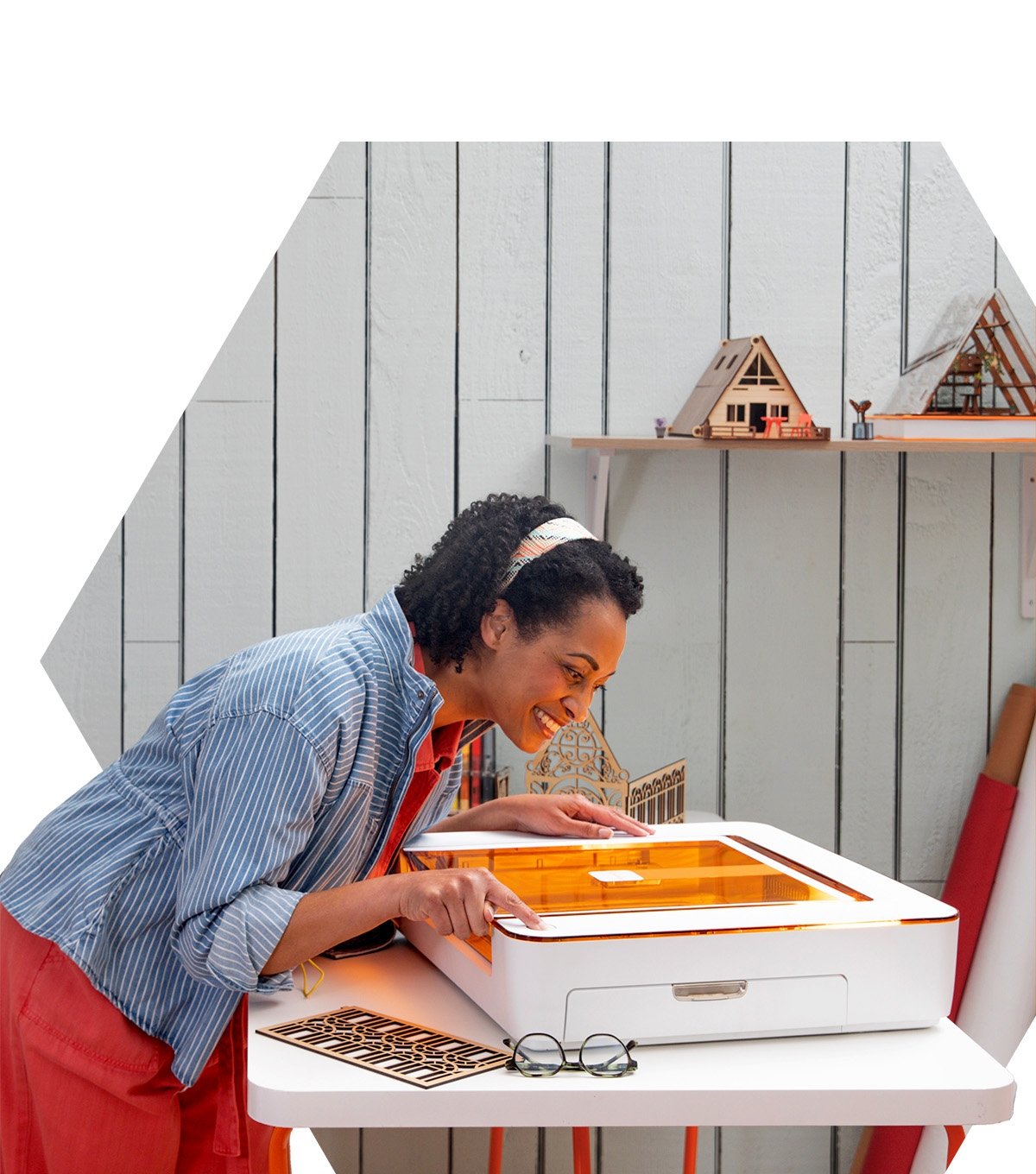
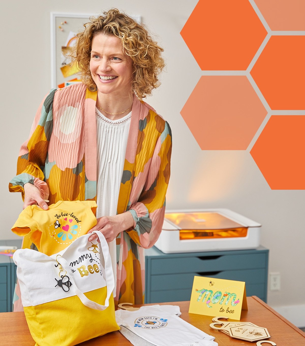
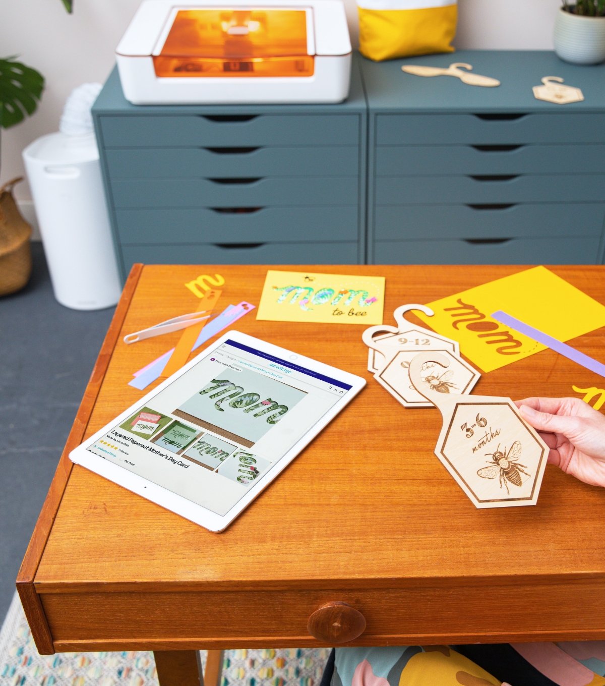
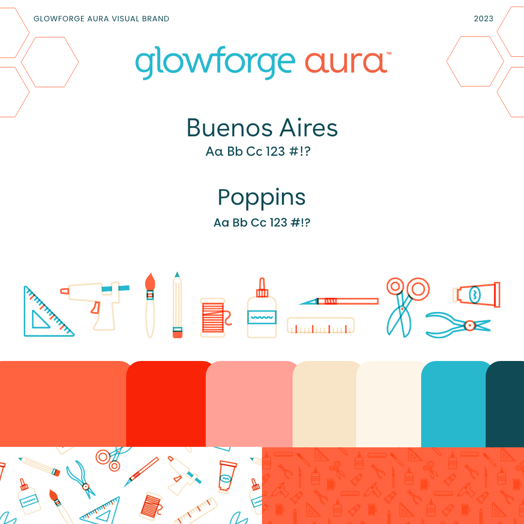
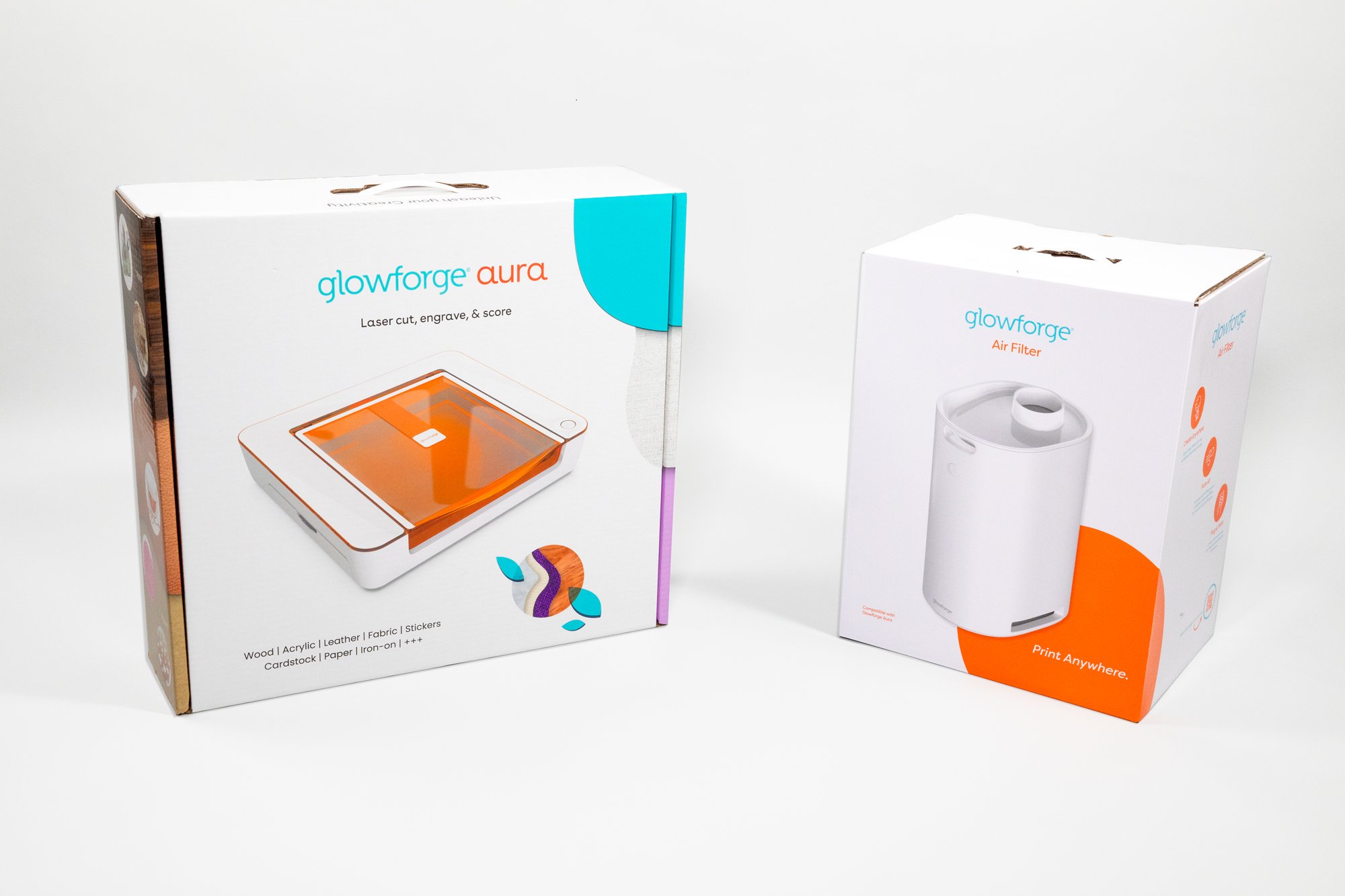
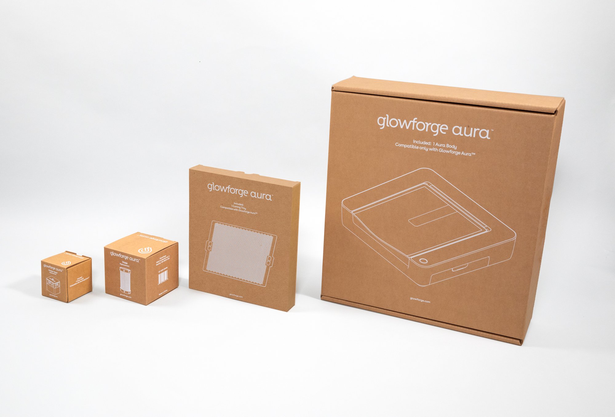
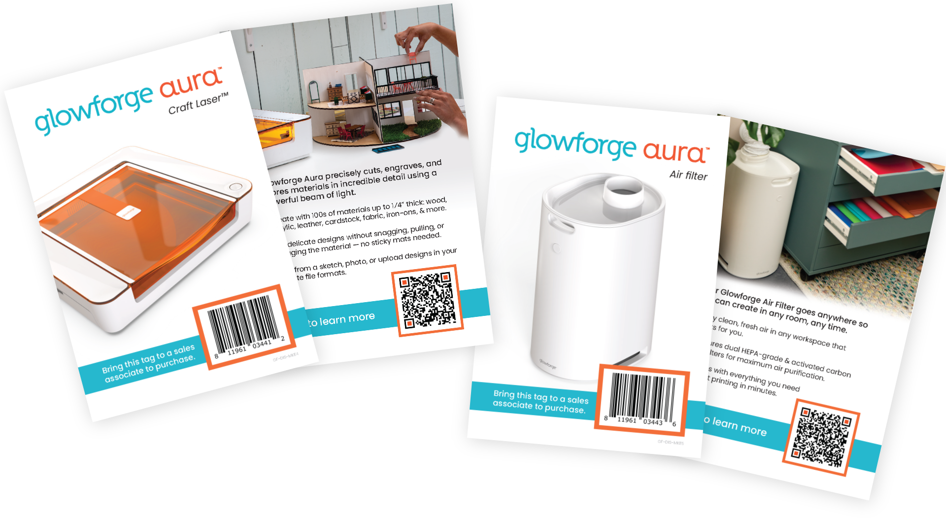
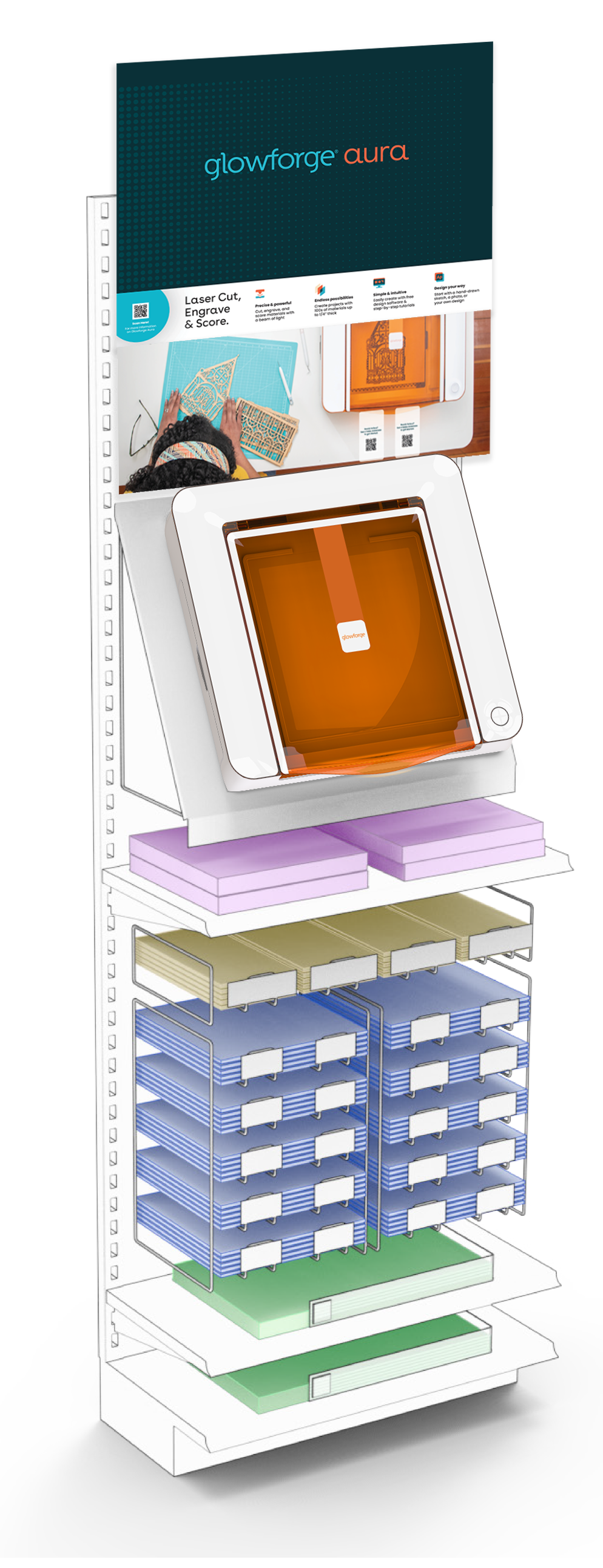
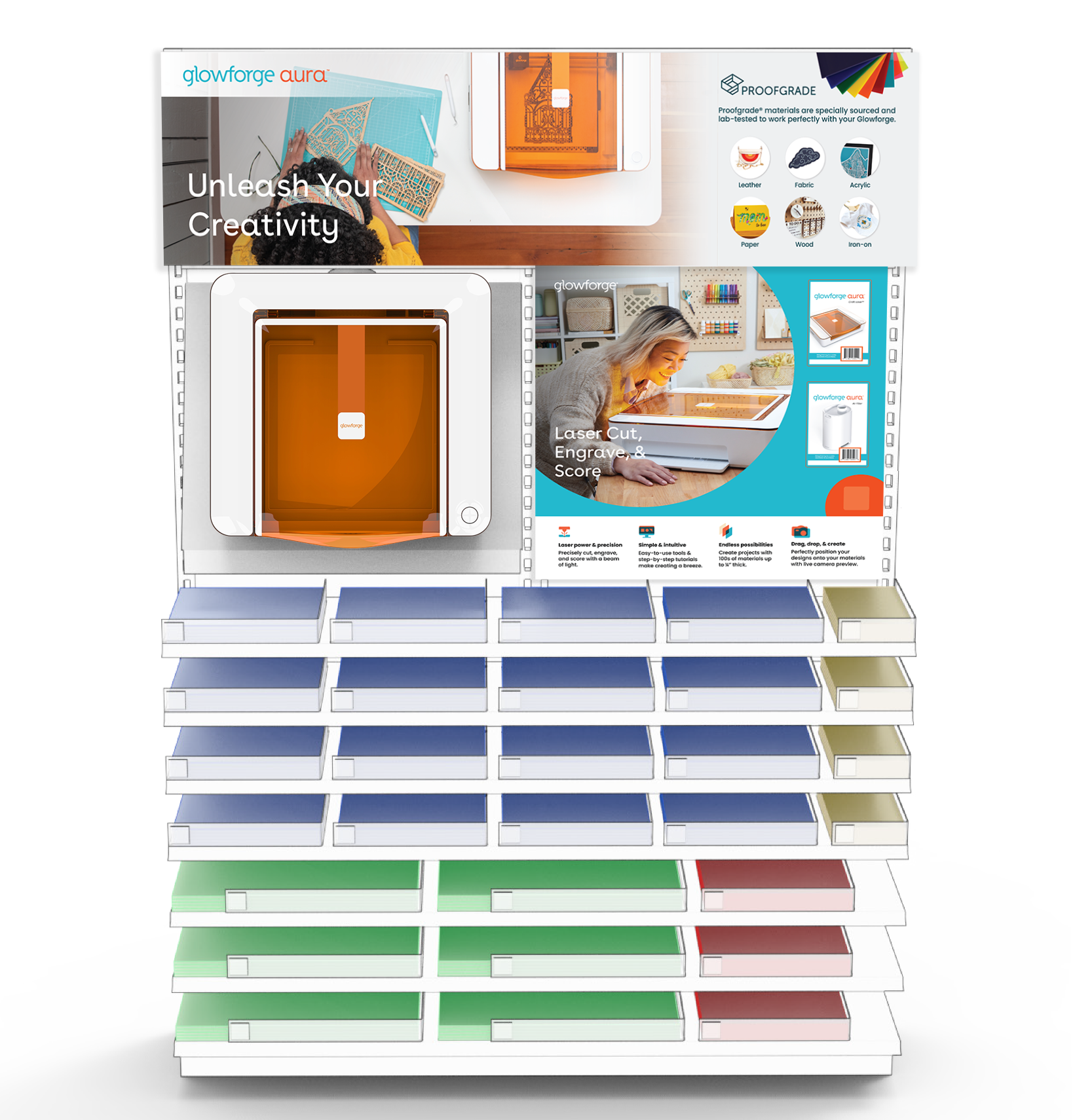
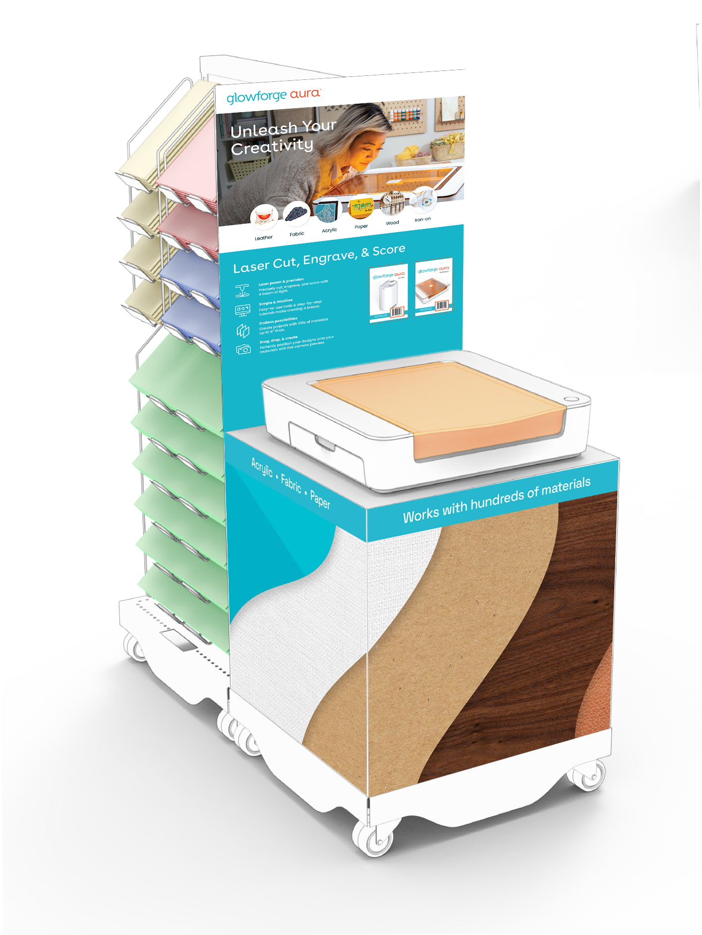
Introducing Glowforge Aura.
This successful product launch at the end of July 2023 was a hugely collaborative effort of a very small team of creatives over the course of many months. As one of two designers on staff, myself and my colleague have touched every aspect of this product & brand, from color & typography to photography & strategy. Props & prints for video and photo shoots, styling, photo editing & color correction — nearly everything was created and completed in-house.
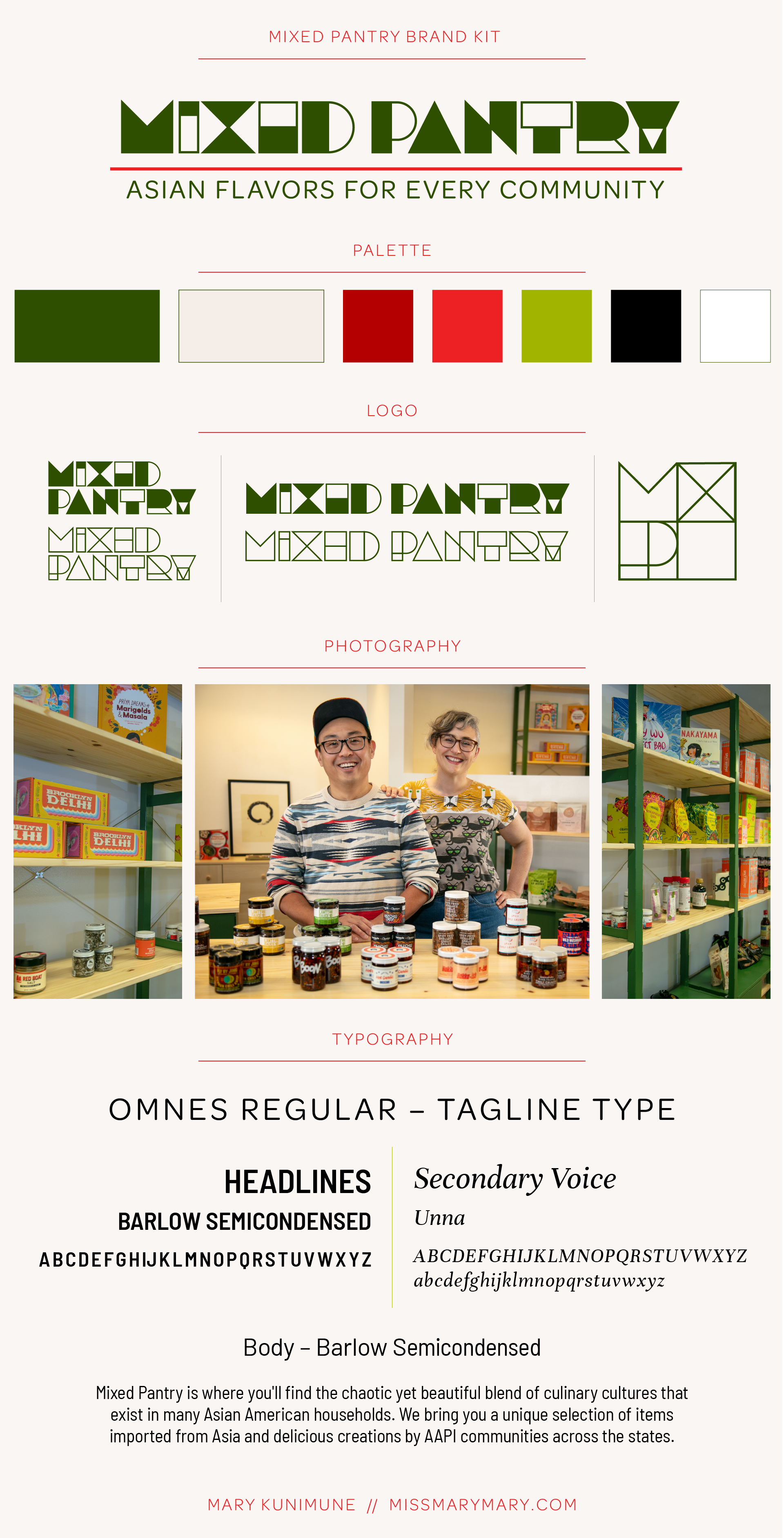
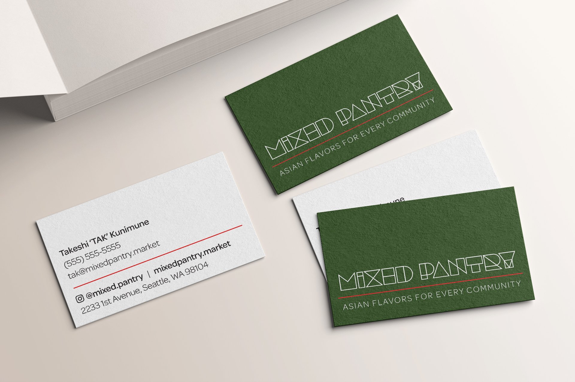
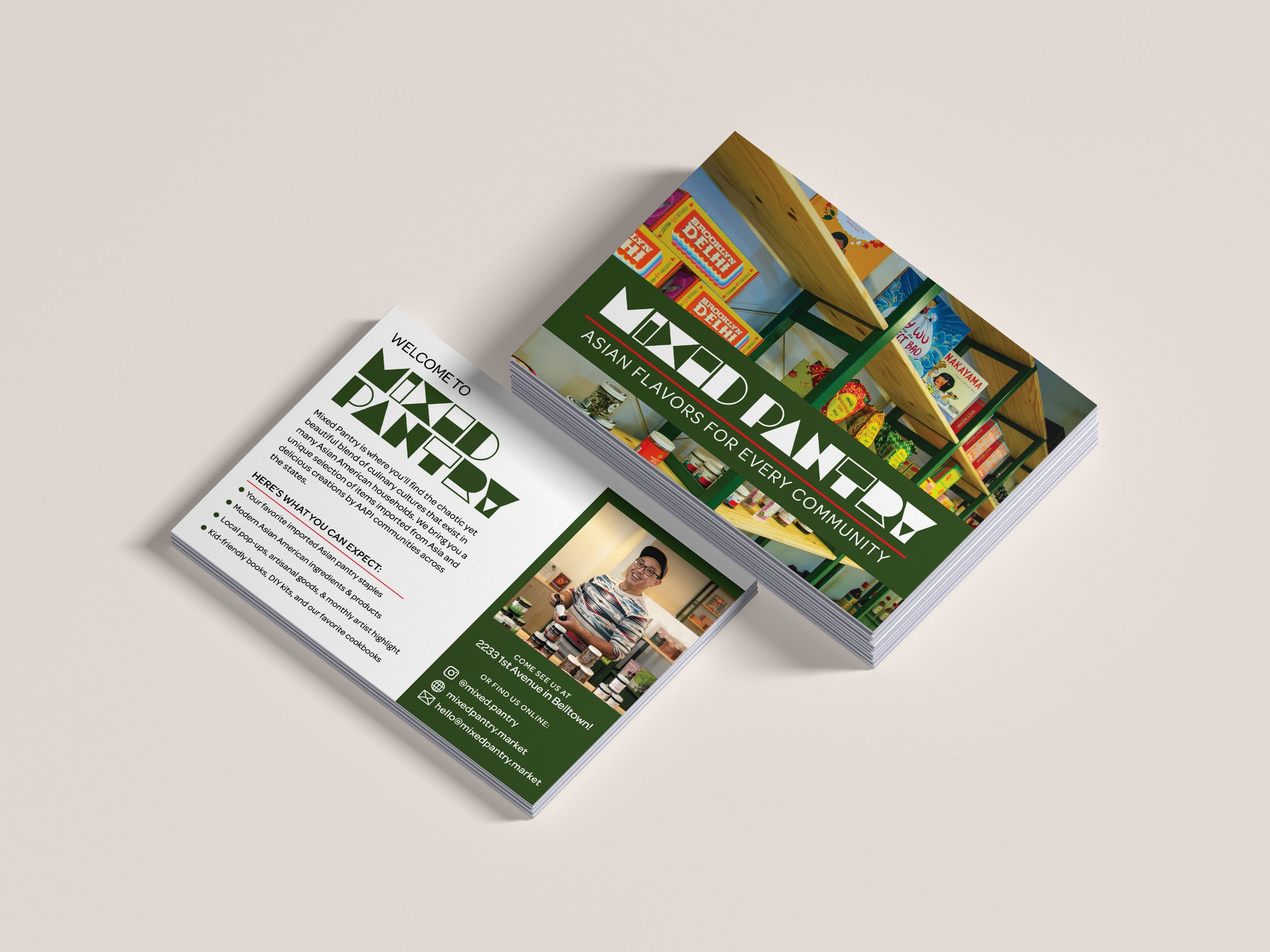
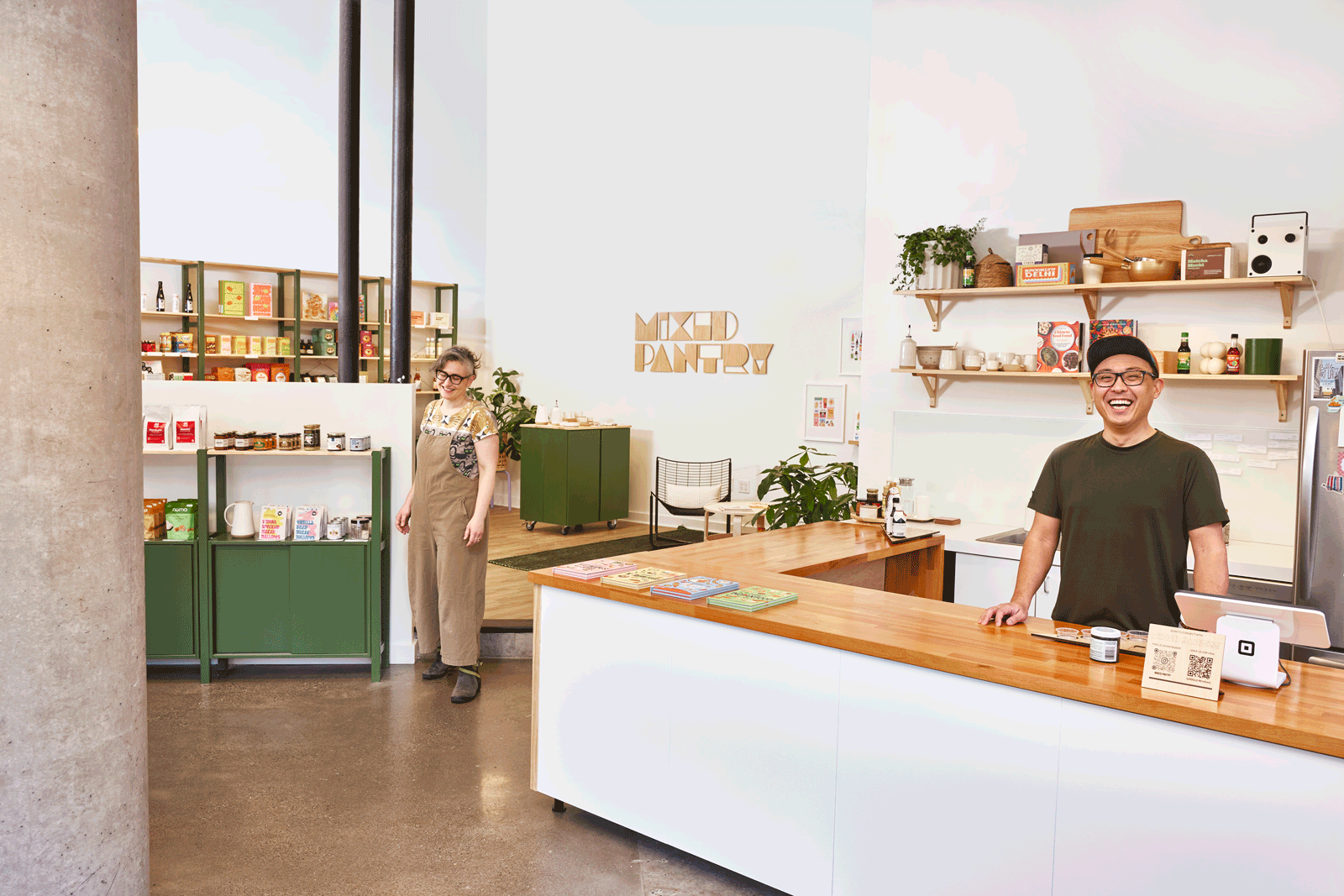
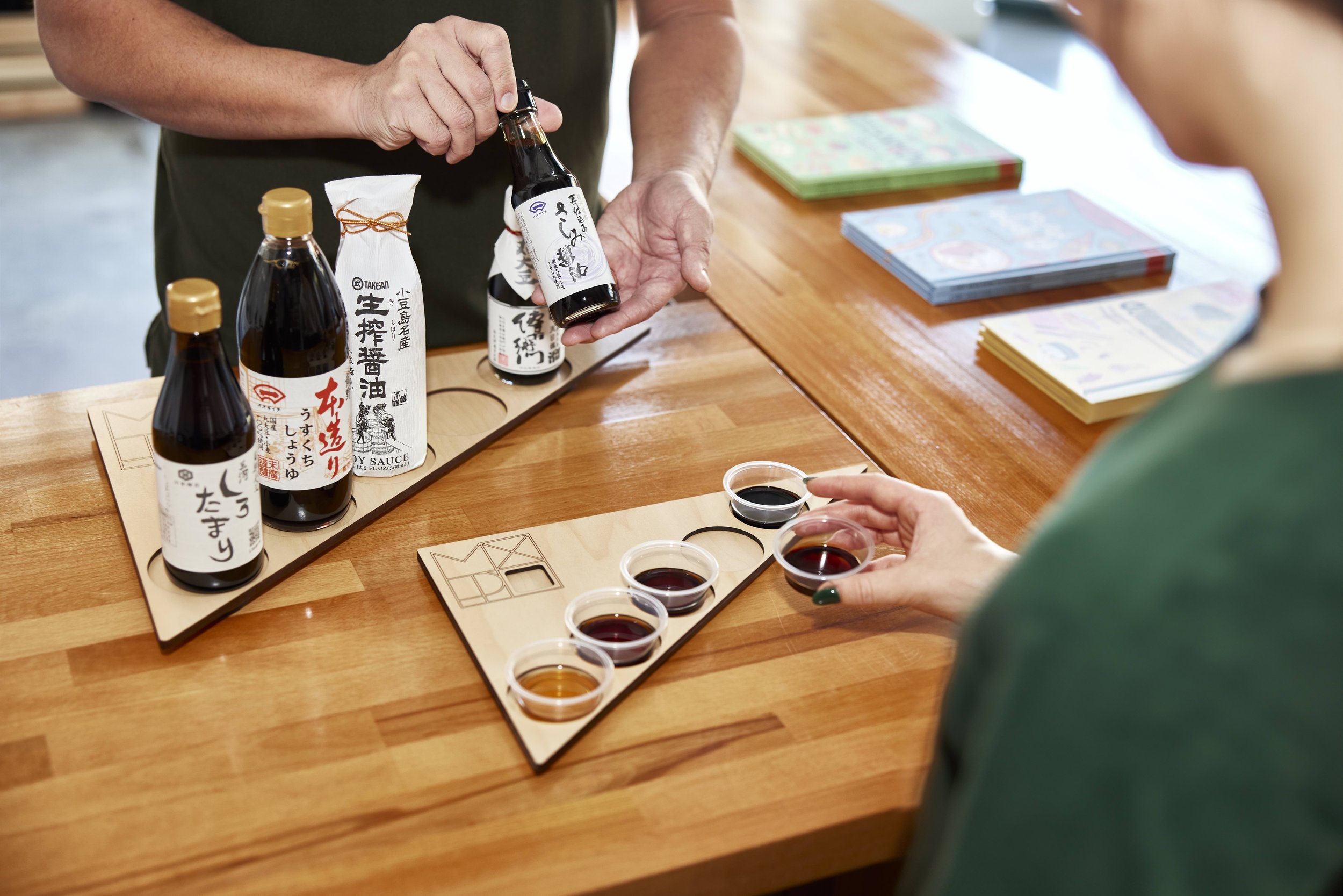
Mixed Pantry
Mixed Pantry is where you'll find the chaotic yet beautiful blend of culinary cultures that exist in many Asian American households. We bring you a unique selection of items imported from Asia and delicious creations by AAPI communities across the states.
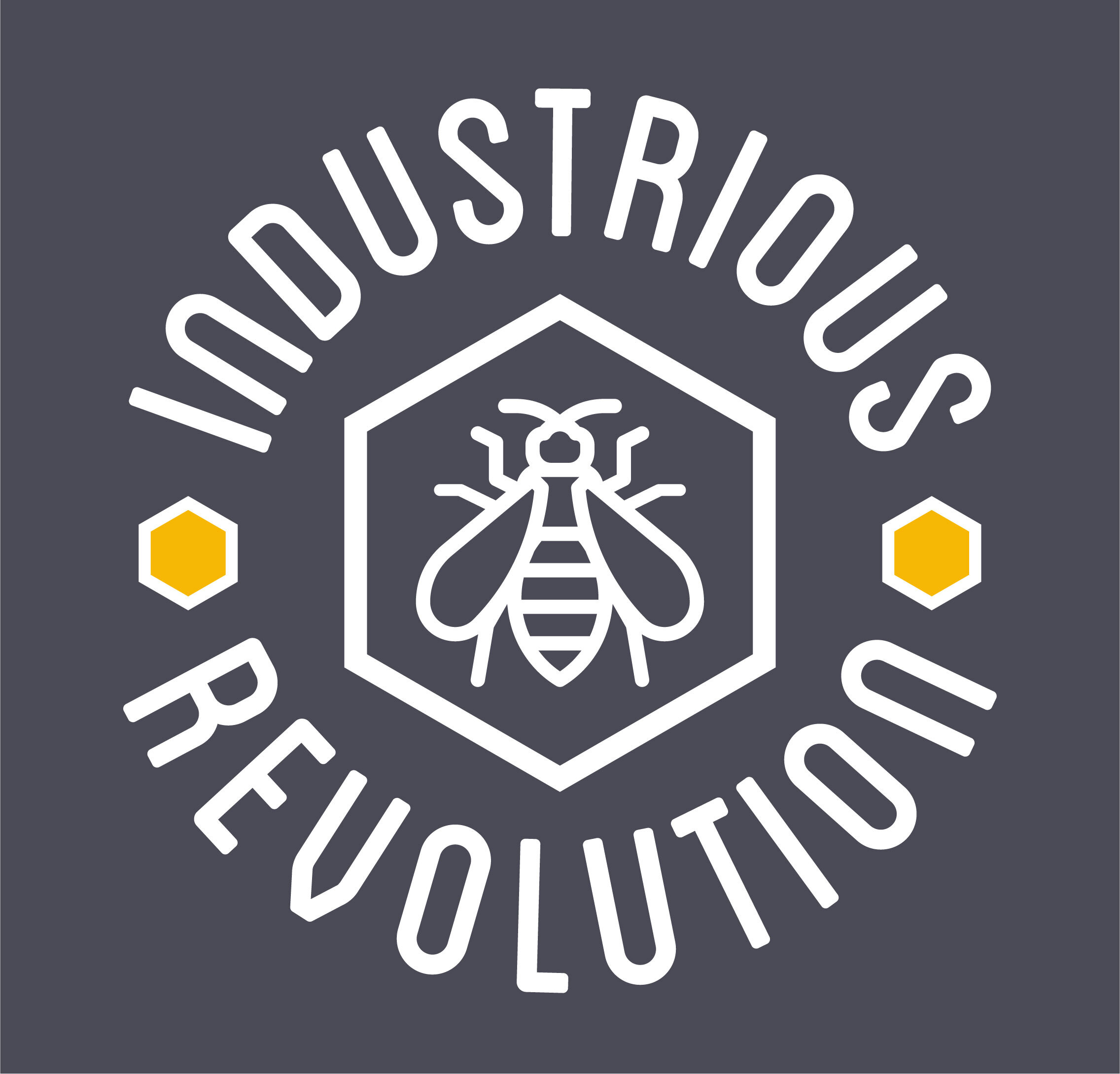
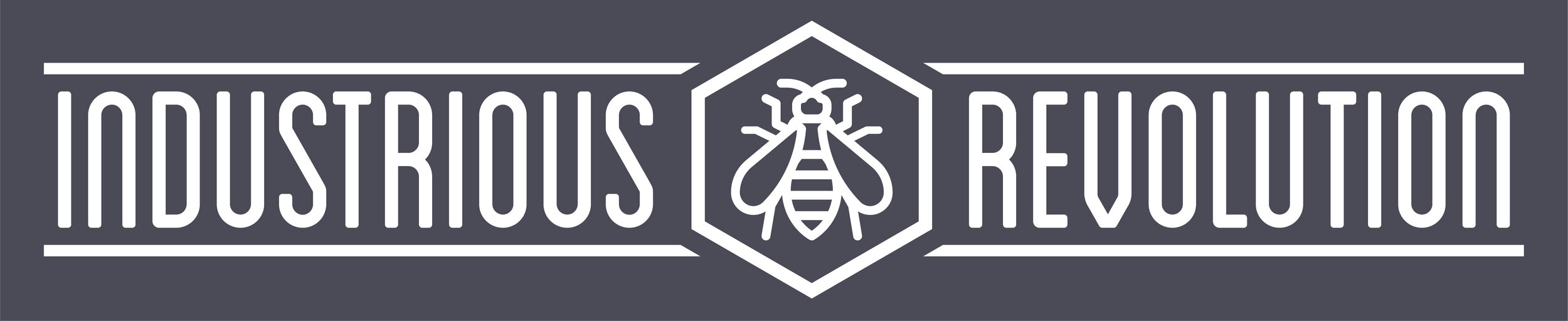
Industrious revolution
The Industrious Revolution logo was created for urban beekeepers out of Lowell, MA. With a background in manufacturing, they were interested in both designing new tools for beekeepers and selling products from their backyard honey production. The logo is designed to work for their entire line of products.
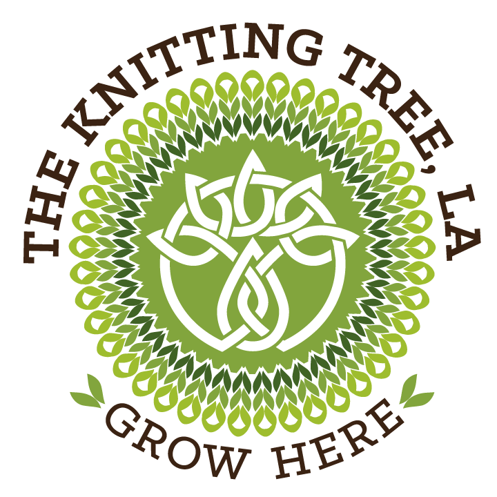
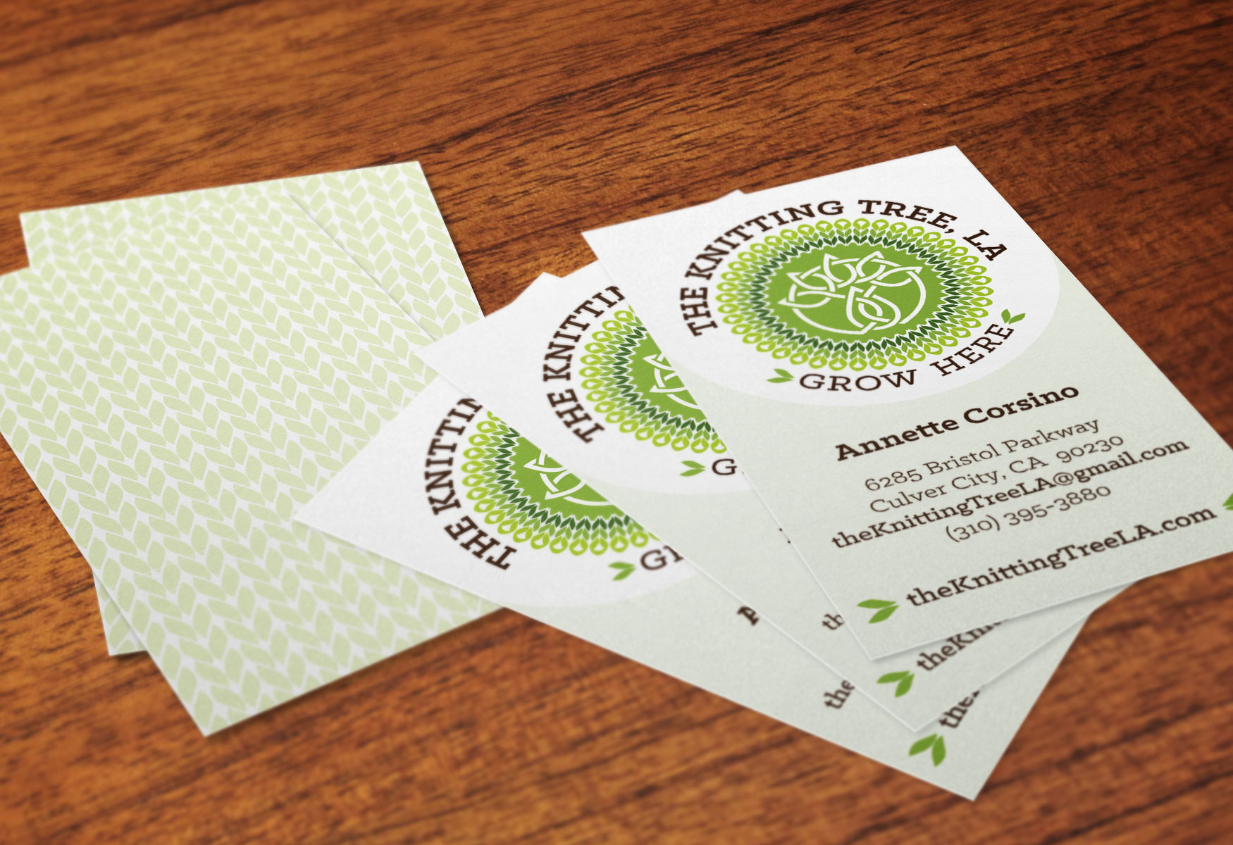
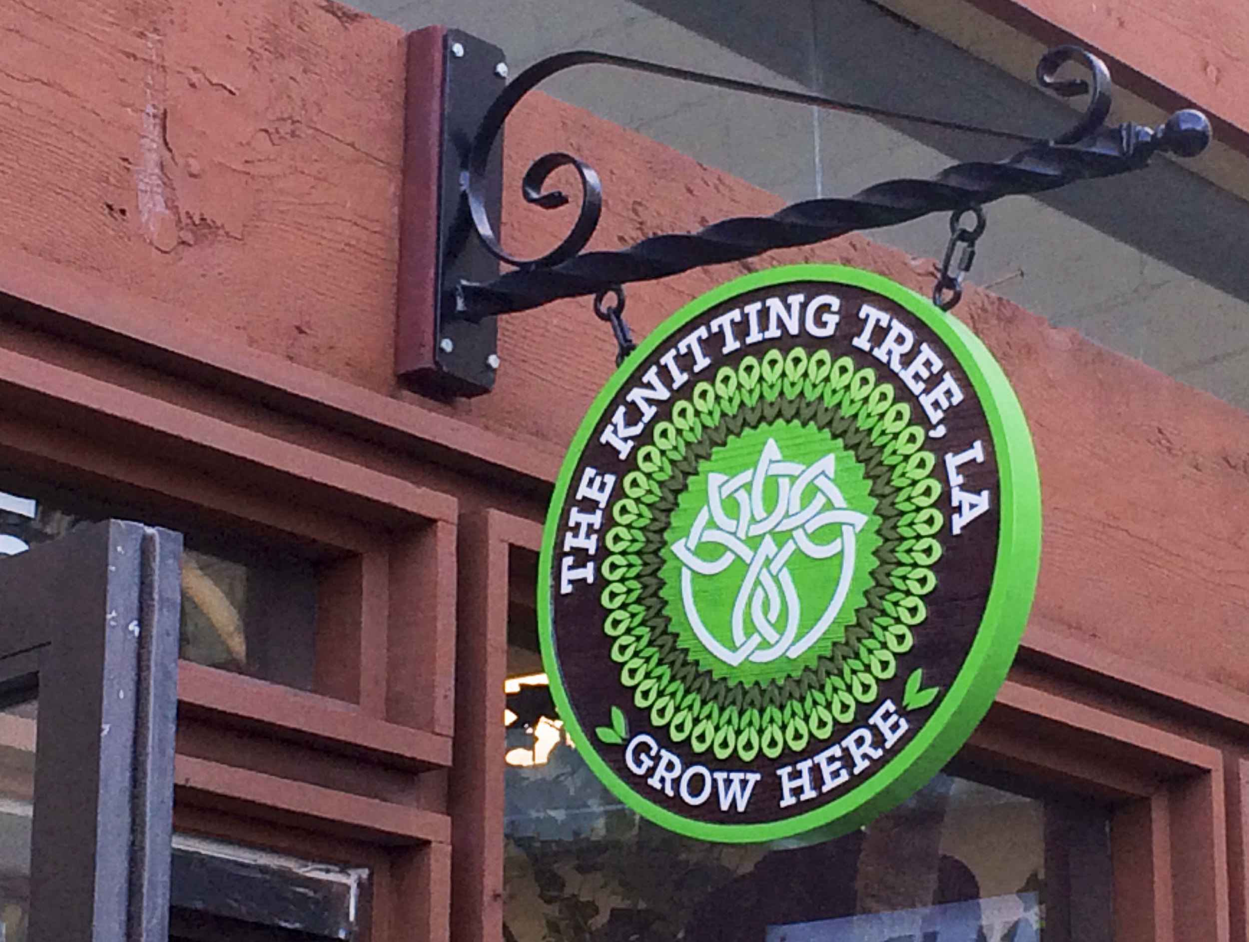
The Knitting tree, LA
The Knitting Tree, LA is a warm, welcoming space ambitiously created in only two weeks when the owners leased space and decided to open a shop. With the only requirements of a Celtic knot inspired by the "tree of life" and "green, earthy colors" the identity utilizes shapes that speak to both growing plants or leaves as well as knit stitches growing from the center of the mark.
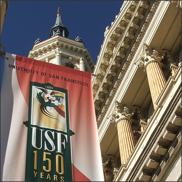
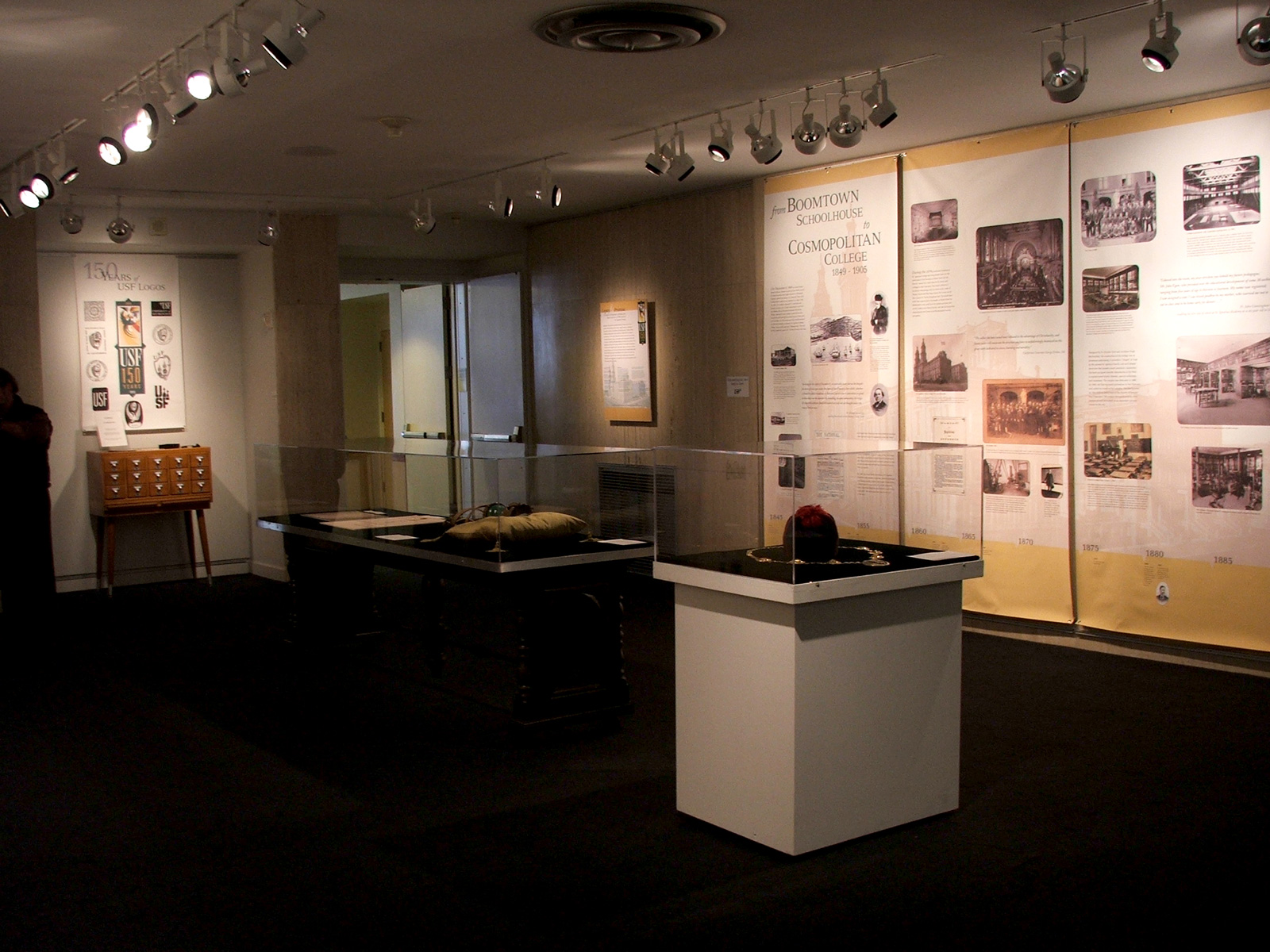
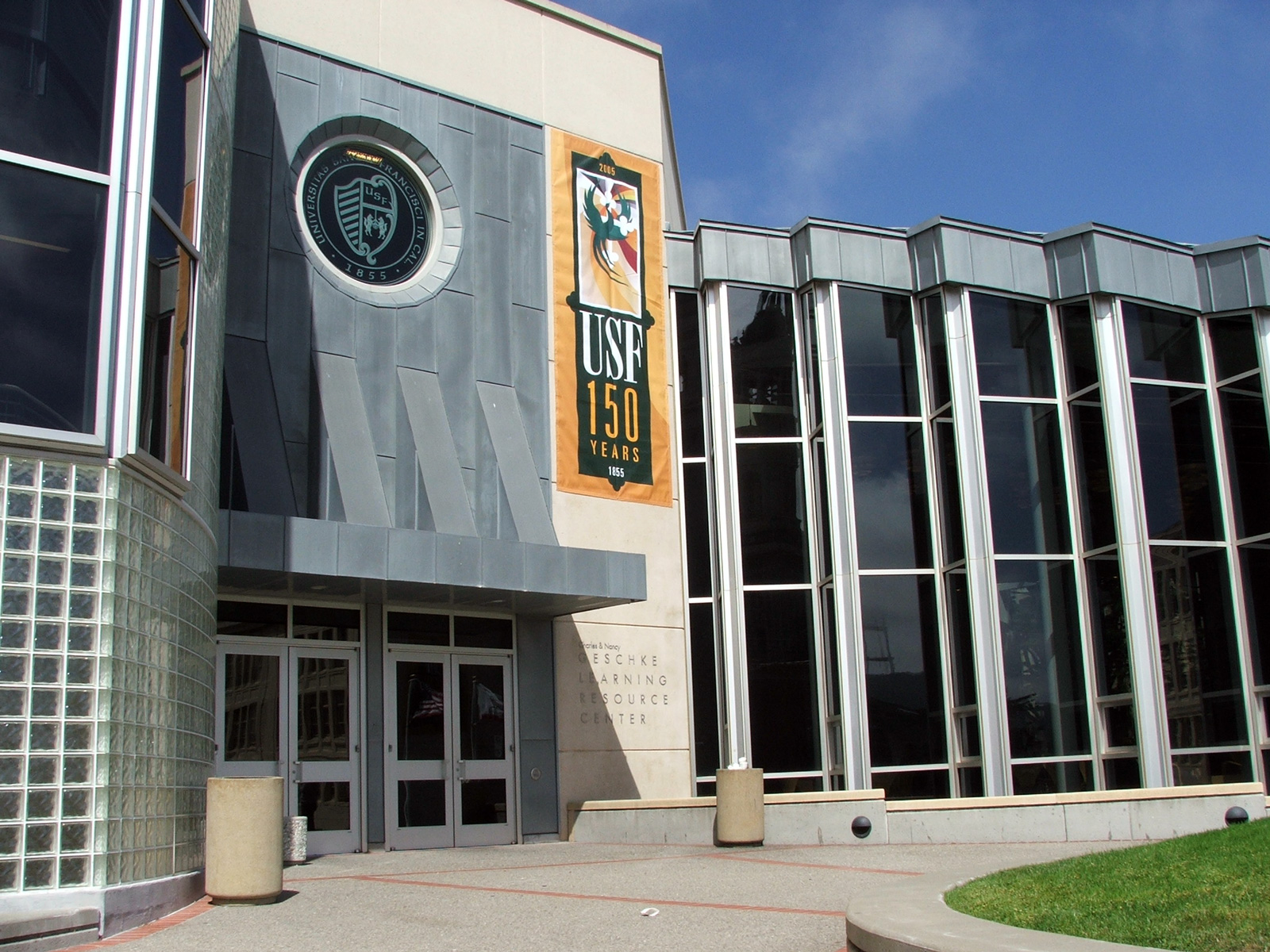
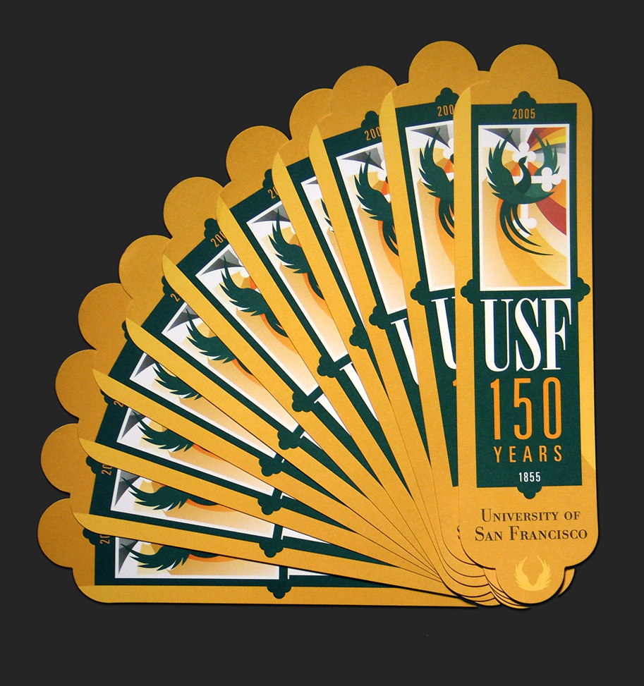
UNIVERSITY OF SAN FRANCISCO, 150 years
A project that has been part of USF’s identity for well over 15 years, the sesquicentennial celebration identity holds a dear place in my heart. Designing the central ‘phoenix’ motif in 2005 and subsequently extending that identity & mark over the next three years was an honor. This mark was displayed prominently on campus as well as throughout the city of San Francisco to celebrate the school's 150th anniversary.